Official Meme Style Guide: How to make a meme.
Almost everyone knows what memes are. Most people have shared a meme or two in their day. For those who don’t or haven’t, memes are images with text added over top. They are an extremely effective way to get a point across. They’re great to use to make a point whether it’s a message you want to broadcast clearly, or a joke you want share. Images are the most often engaged with and shared method of posting, so in that regard, memes are arguably the most effective sharing vessel. They allow you to integrate text into an image that has potential to go viral.
Though many have seen them, not many create them with the appropriate meme style.
Here’s how to make a meme.
1) Choose an interesting photo
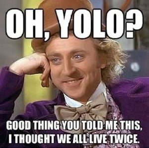
The photo should illustrate the point you’re getting across. Many people reuse great images, and provide a new angle, using different text. A very common one is this Willy Wonka image.
2) Add Your Text with Meme Styling!
Font: Impact Text Color: White Text Style: Add black stroke
There’s an official style of text in memes. You need to use the font called “Impact”. The text needs to be colored white and there needs to be a thin black line around the outside of the font. This effect is called a “stroke” in Photoshop. The font size should be adjusted for maximum readability. That’s how to make a meme.
3) Resize the Meme for Your Social Media Channels
Facebook: 4×3 (1000×750 minimum recommended by us)
Instagram: 1×1 (600×600 minimum recommended by us)
Twitter: 440×220 minimum
4) Publish Your Meme!
Now you know how to make a meme. Don’t hide your meme in a lonely sub-directory. Share it to social media. You are now officially the creator of a meme!


Leave a Reply
Want to join the discussion?Feel free to contribute!