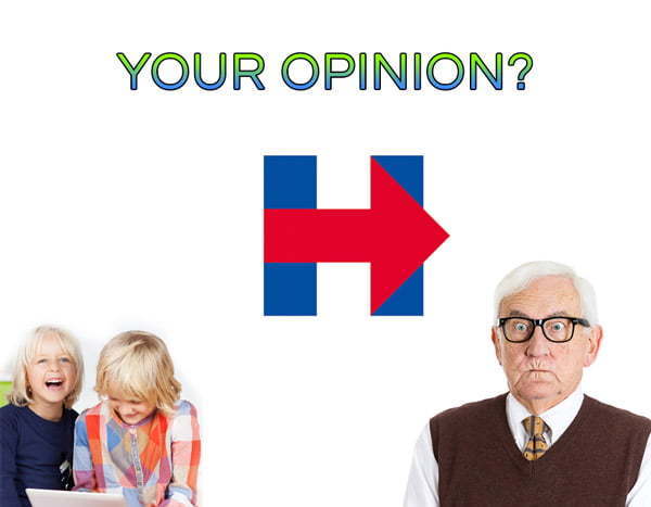
2016 Campaign Logo Design: Share Your Opinion
We want to hear what you think about this new campaign logo design: the new Hillary Clinton 2016 Campaign Logo.
People have already begun to talk about it on Twitter according to Slate.com. We’ve talked about how social media considerations should be part of your company logo design in previous blog posts. At least it’s squared up and ready for using as a profile photo. But are there things about it that make YOU like or not like?
A campaign logo becomes the stamp of authenticity for a running political figure, and Obama’s campaign logo design was met with mixed feelings. Now we can all recognize the Obama logo; it’s been used in so many ways that everyone in the USA has seen it several times. It was round. It had gradients in it. It incorporated red, white and blue. No matter what background you put it on, it stood out gracefully without contrast problems. That’s the kind of logo design we admire here at Massive Impressions, because we know the challenges of using logos across a variety of media against a variety of backgrounds.
With Mrs. Hillary Clinton’s confirmation that she’s entered the race for the Presidency, a new campaign logo design has been developed to represent the former Secretary of State’s campaign. It’s not just a little different than the logo we’ve gotten used to for the last eight years. It’s a universe away from Obama’s logo in terms of design. It’s so different, we started wondering how other people felt about it.
Take a look. Please give us your subjective opinion on whether you like the logo or not. Whether you’re a professional graphic designer or just a voter, tell us what you think. Don’t be shy, participate in our poll.

Political Logo Poll
When you’re finished with this poll, please take our other poll about Marketing Discrimination.


Leave a Reply
Want to join the discussion?Feel free to contribute!